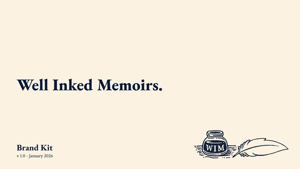
Well Inked Memoirs
Brand Design (2026)
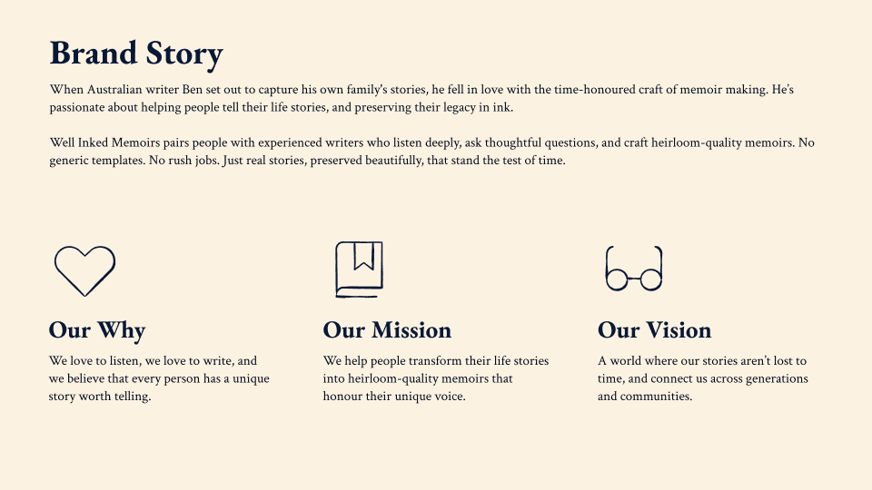
Brand identity and web design for Well Inked Memoirs, a bespoke memoir-writing service that helps people capture and preserve life stories with dignity and warmth.
Process
Discovery Workshop
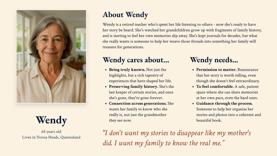
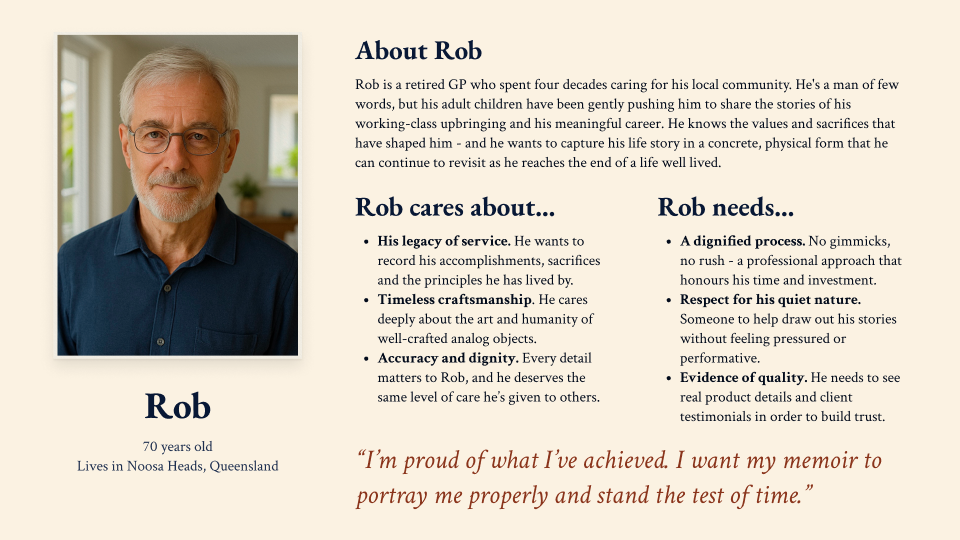
We started by getting clear on where the client was at: their existing brand, their customers, what else was in the market, and what they admired. We sketched out some rough personas together, which gave us a shared language to work from.
Direction Workshop
After presenting three distinct brand concepts, we reviewed directions, refined the personas, and started making material decisions: moodboards, mockups, the first tangible sense of what this could look like.
Designs
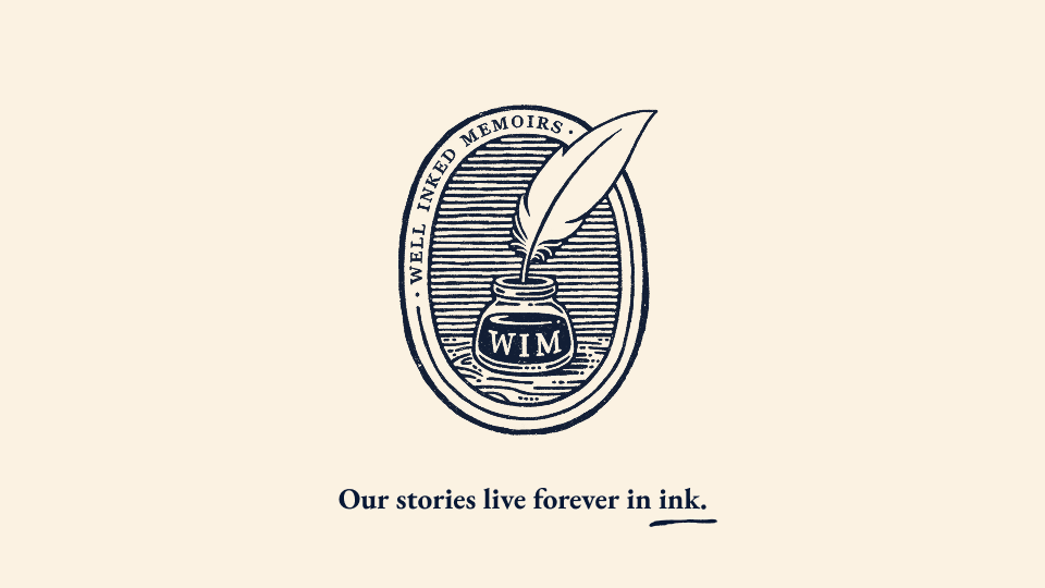
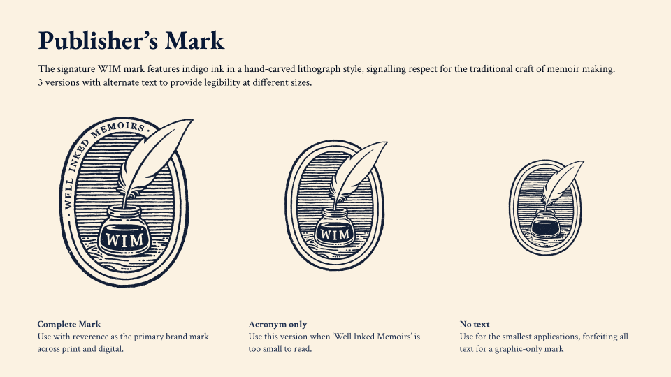
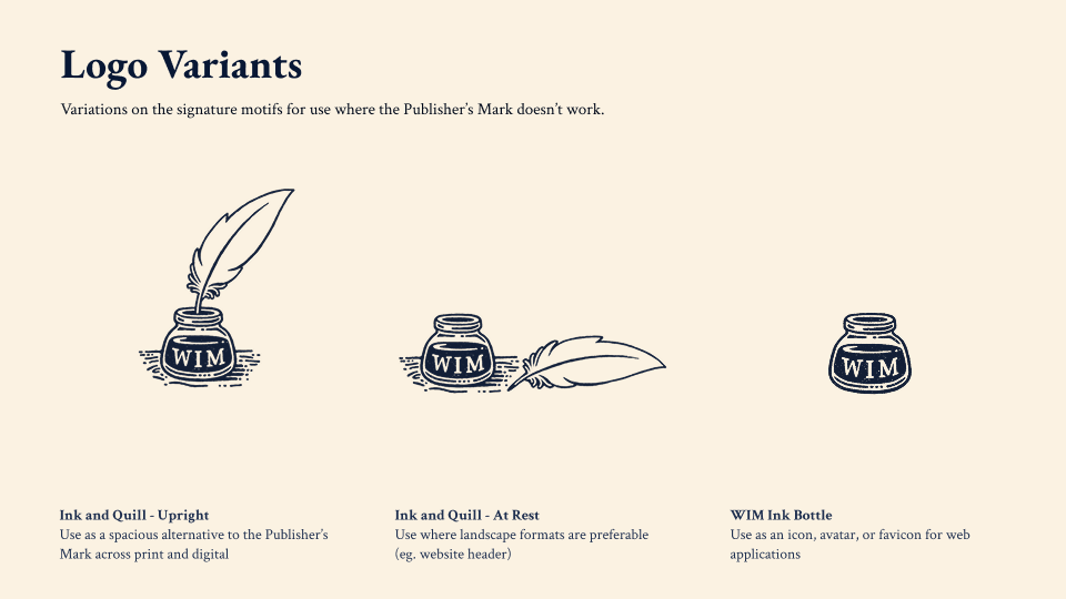
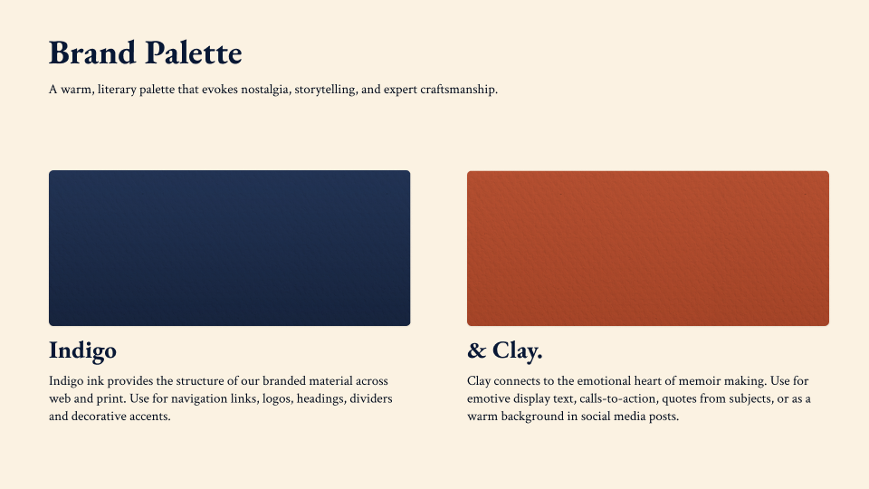
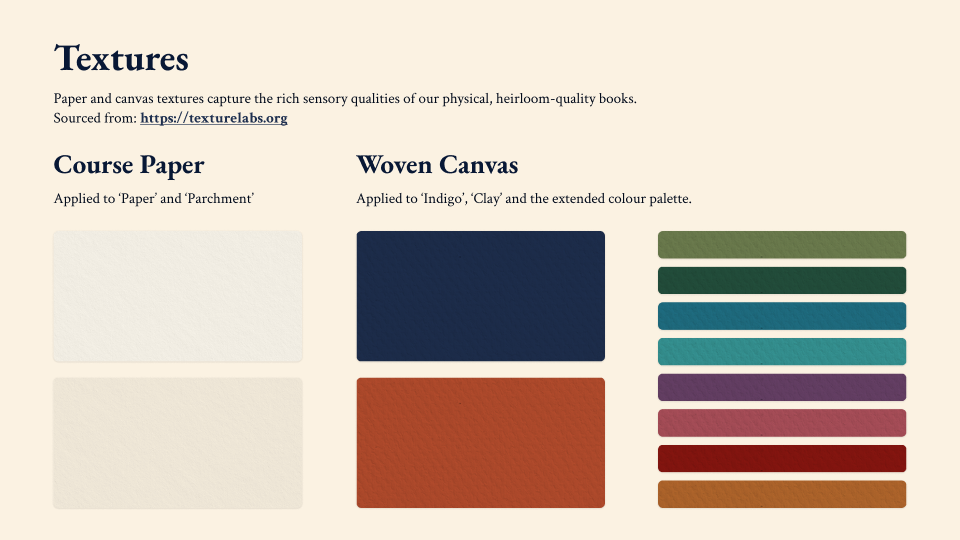
Two iterative rounds brought us to the final mark. Audience feedback the client gathered between sessions shaped things significantly. One direction wasn't landing with an older audience, felt a bit too modern. I went back to research and found the answer in warmer palettes and more active, direct language. The final mark is a lithograph-style stamp: warm, elevated, a bit weighty, the kind of thing that feels like it belongs on a book cover.
Deliverables
Everything needed for the WIM team to establish a consistent brand identity across digital and print: illustrated logo and variants, publisher's mark, colour and typography systems, copywriting guidelines, sample web design, and refined client personas.
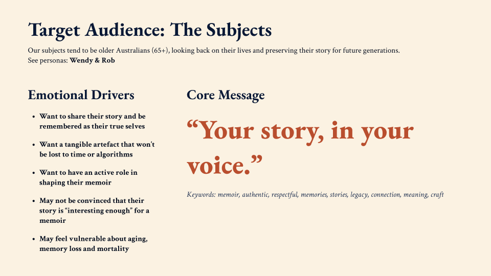
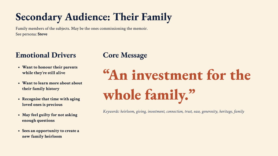
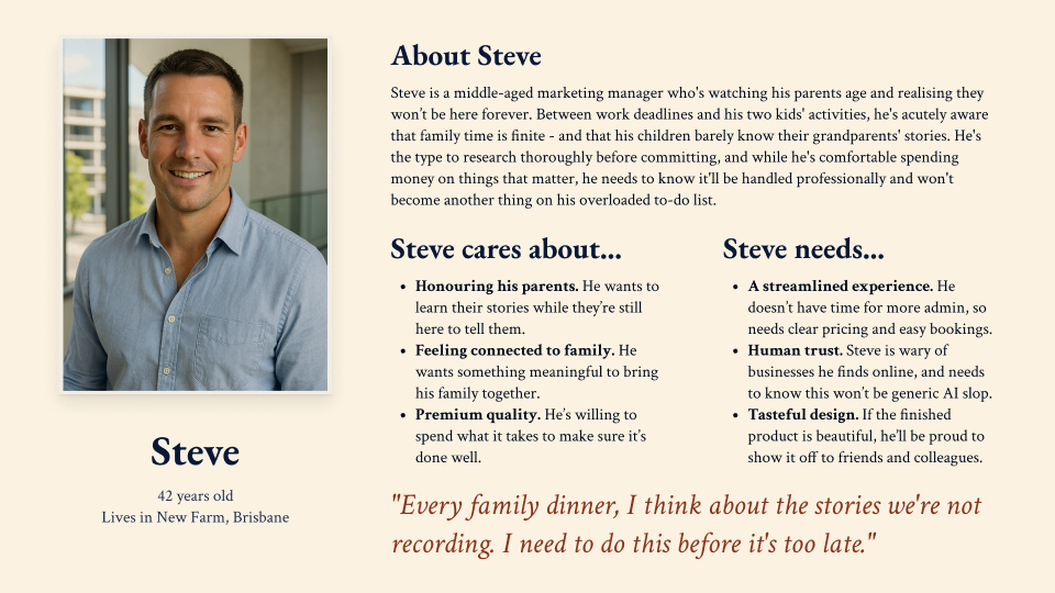
The Audience Question
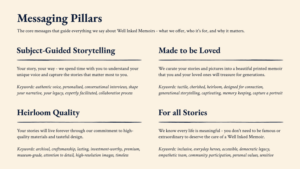
The brief had an inherent tension: memoir subjects (often older adults) and the people who commission stories as gifts. We decided the subject had to be primary, since the whole positioning was around an active memoir-making process, and even if someone else was paying, it needed to feel resonant for the person it was for. The challenge was speaking to the enormous diversity of people who might want their story told, and reassuring those who weren't sure their life was "interesting enough." The answer was a warm, minimal design with enough weight that it steps back and lets the person's story take centre stage. I recommended a dedicated gifting page and made ease of booking a priority for commissioners.
AI and the Human-First Question
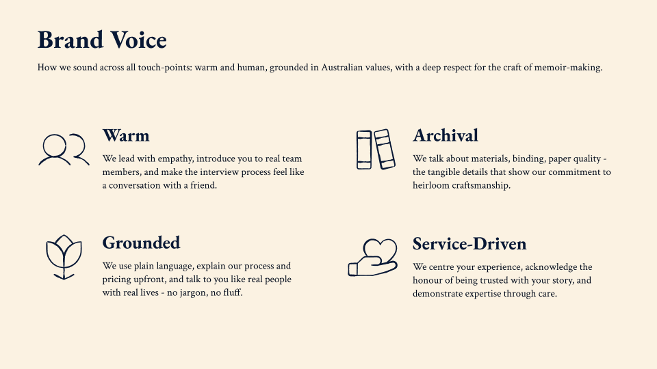
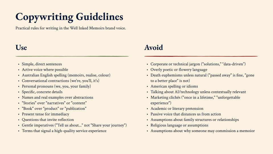
Well Inked Memoirs uses AI tools to make the memoir process more accessible, but it's fundamentally human-driven: real interviews, real writers, humans shaping every story. How to talk about that publicly was a genuine brand challenge. My advice was not to lead with AI. The subjects sharing their stories are often older adults opening up about personal and vulnerable material. Trust comes first. I recommended leading with the team's skills and the founder's own story, and addressing AI tools clearly and honestly in an FAQ. The copywriting guidelines I wrote flag AI as something to avoid mentioning unless contextually relevant, a rule that reflects the positioning, not an evasion.
What I Learned
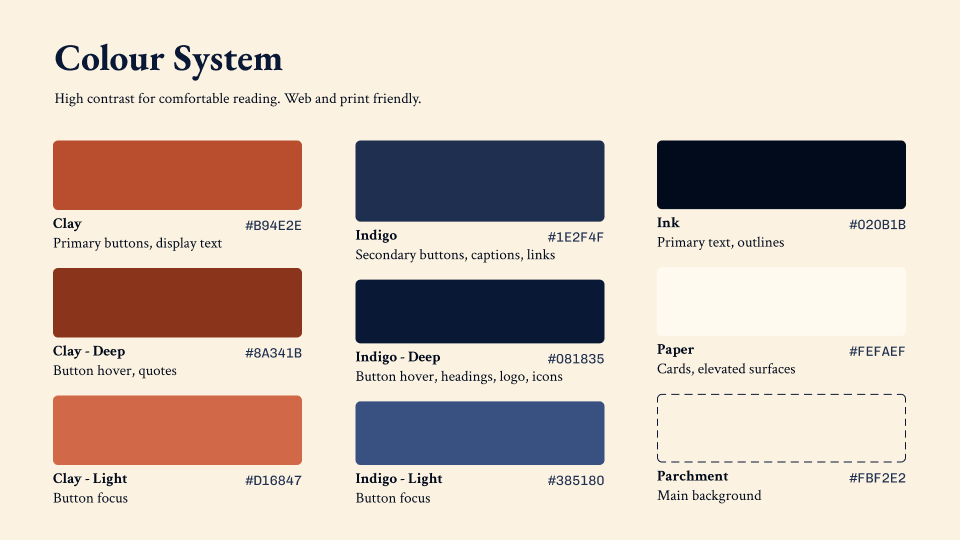
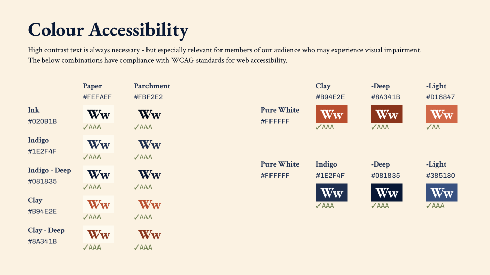
Let the audience reshape the work. When early feedback suggested one direction felt too modern, it would've been easy to defend it. I treated it as useful information instead, went back to research, and we landed somewhere better for it. Designing for older adults improved the experience for everyone: high contrast, clear navigation, active language, progressive disclosure all ended up serving the whole audience.
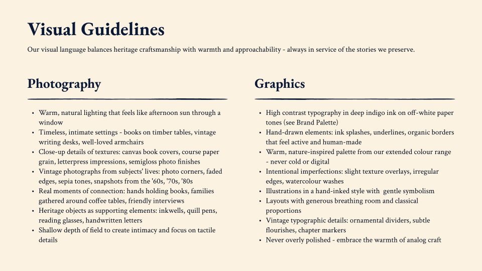
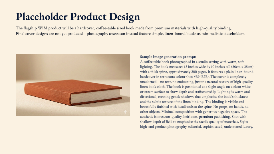
Designing for real humans. There's something about making a physical object of a life that I find genuinely moving. The intergenerational dimensions of recording personal history, the tactile sense of having your story properly archived: photographs, memories, all of it gathered into something you can hold. I never go back and look at my old digital photos. Objects carry meaning in a way that files don't. The best thing I could do for this project was keep the design understated enough that the person's story stayed the main event.
This project is an example of the express brand design service I offer for small businesses and sole traders. If you need a professional brand identity (or know someone who does), get in touch.