Hop To It
Information Design (2025)
A project I worked on with my mum for the 2025 Australian Federal Election. We produced a non-partisan, illustrated guide to voting in your electorate.
Challenge
I'd been feeling disengaged from politics and didn't know how to go about getting up to speed before the election. I teamed up with my mum (an activist and lawyer) to learn more about our democratic process and build a resource that might help others feel more confident in planning a great vote. Our main goal was to strip away the noise of party politics and media bias, to create a simple, accessible resource for voters to build a preference list based on who they actually trust to represent their community's interests.
Approach
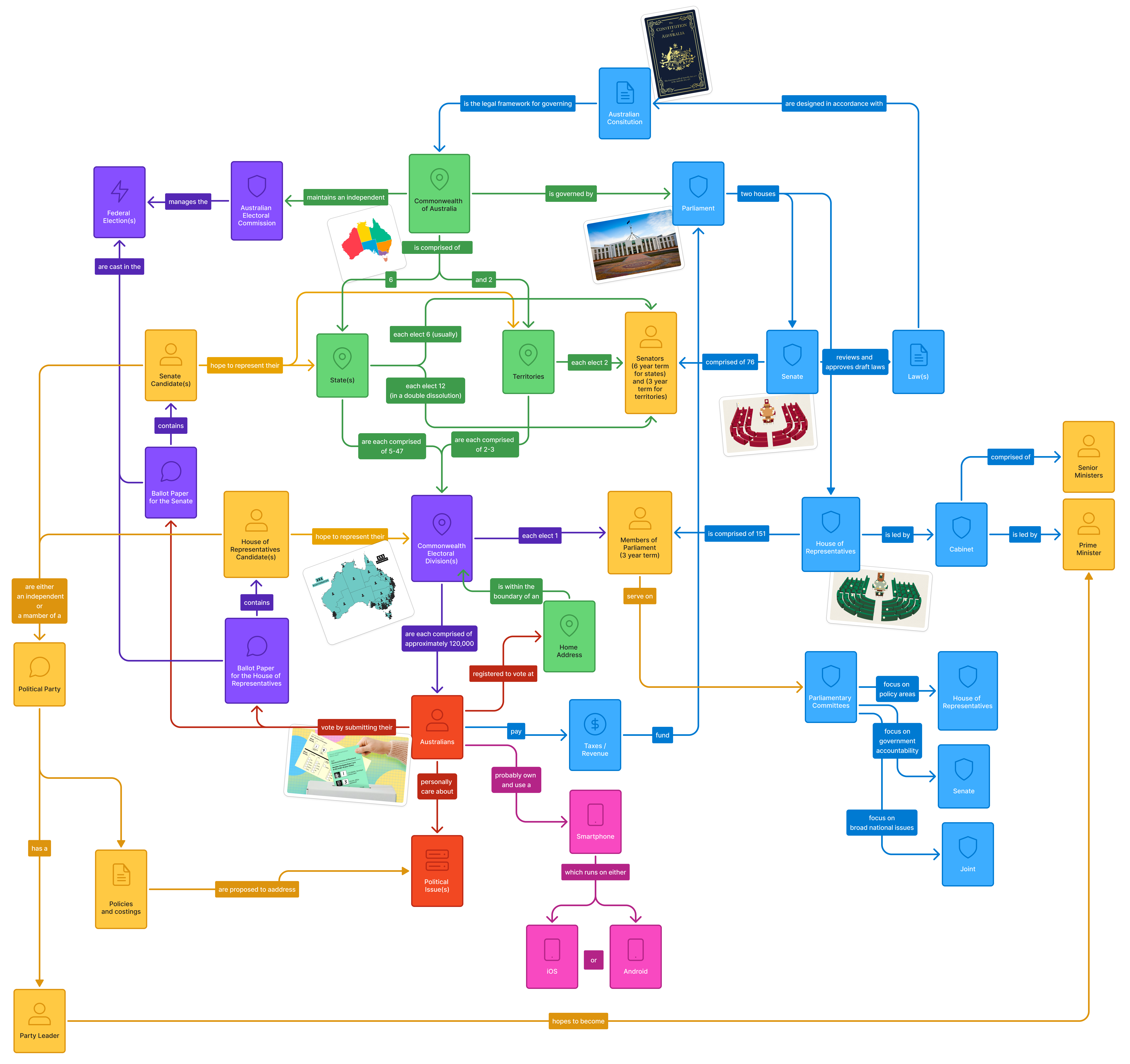
Domain Modelling
I constructed a model of Australia's electoral process to understand the interplay between actors, institutions and artefacts. Mum and I refined it together and pulled out the key concepts to reinforce in our designs, keeping the perspective of a disengaged voter front of mind.
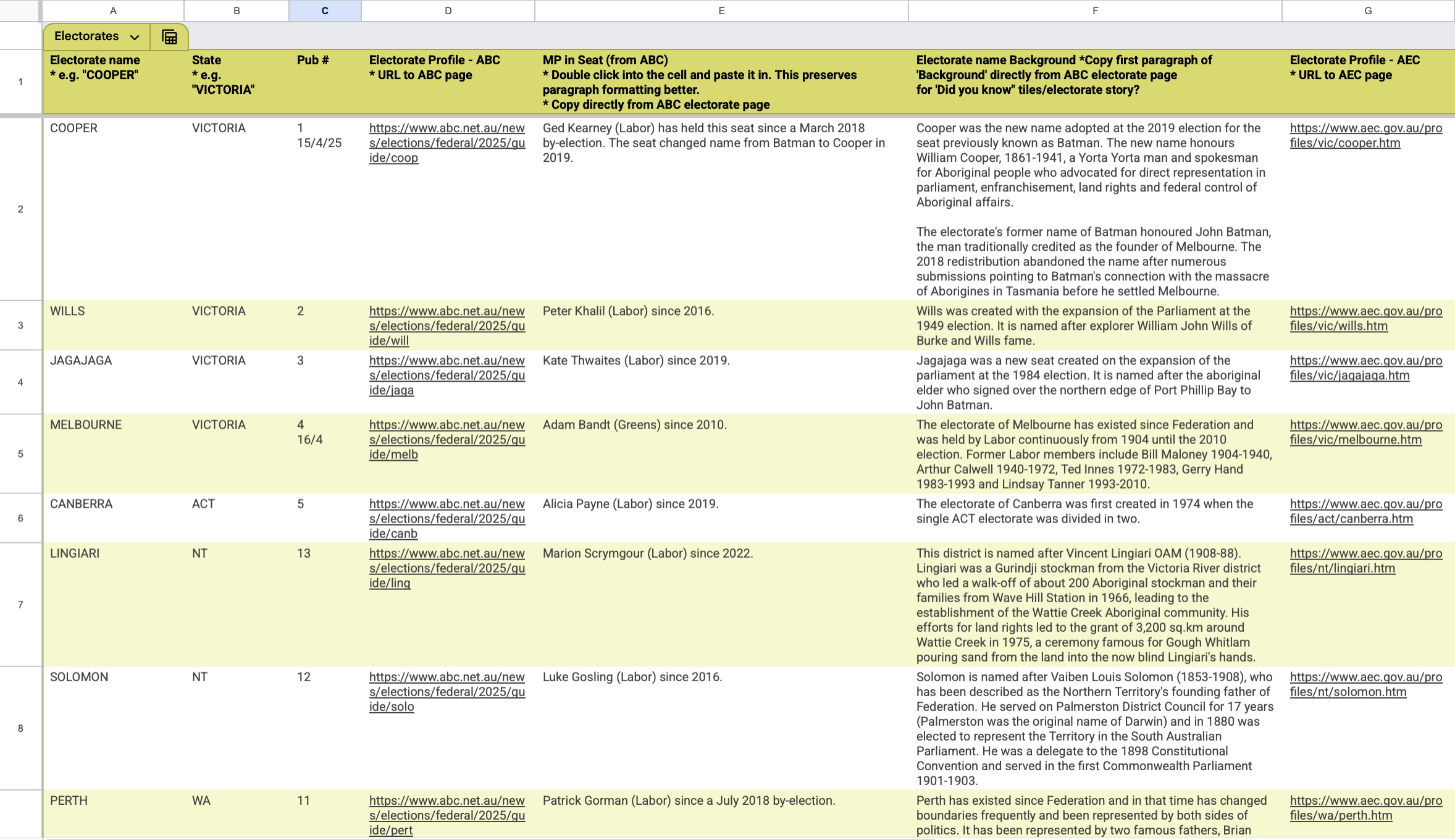
Data-Driven Templates
We designed a lightweight relational database to store the states, electorates and candidates. Our system utilises authoritative data from the AEC and the Parliamentary Handbook, and compiles the candidate's public-facing bios, scraped from their campaign websites.
Storytelling Through Illustration
We wanted to make the abstract world of policy feel closer to home. Illustration was a distinctive way to engage voters with complex ideas through familiar images and plain language. From our domain model, we looked for visual and tactile touchpoints to anchor our illustrated world in Aussie democratic values: Parliament House is a real building with a real chair where your elected representative will sit and advocate for your community; on election day, you cast your vote with a pencil on two different-coloured papers and celebrate with a sausage sizzle.
Solution
Character Design
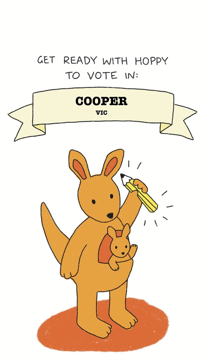
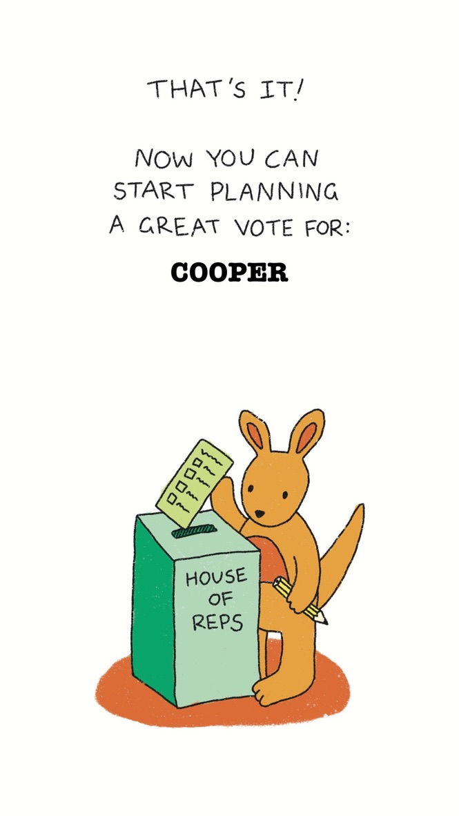
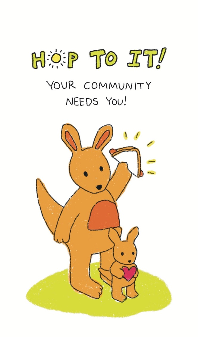
Our hero kangaroo navigates the journey from confusion to confidence, while caring for a young joey. Using animal characters as proxies for voters (rather than identifiable human faces) creates a sense of universality and removes the visual cues that can trigger partisan responses. The parent and child dynamic also captures the generational factors that shape the way we vote for the future.
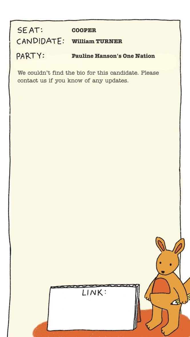
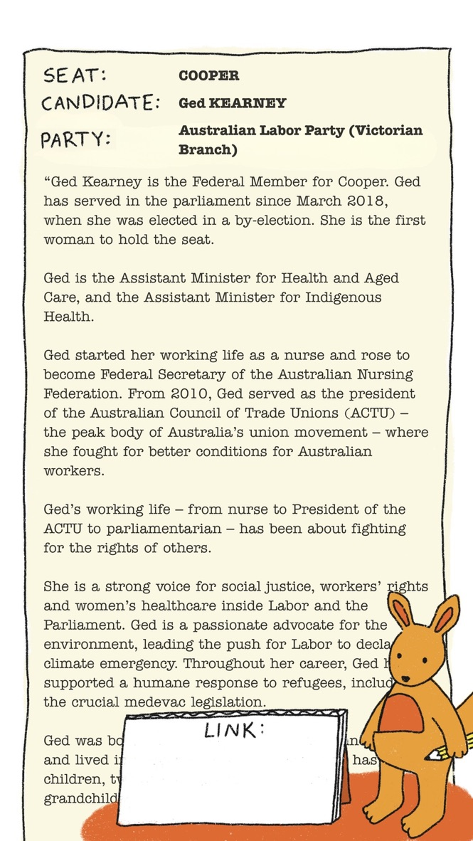
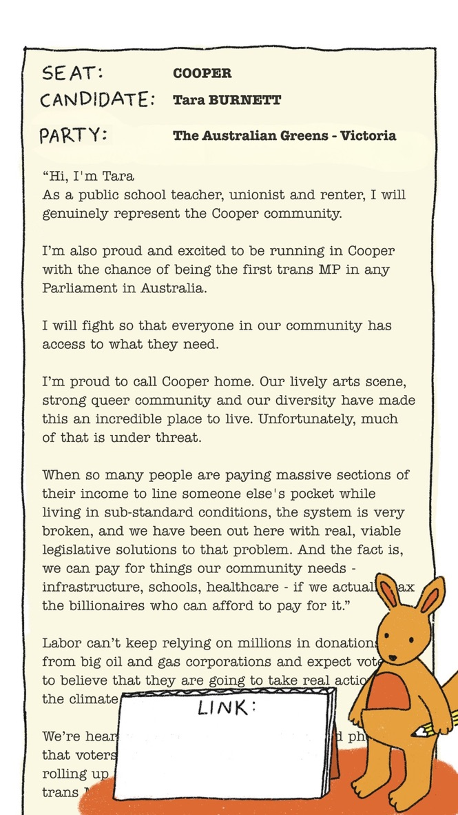
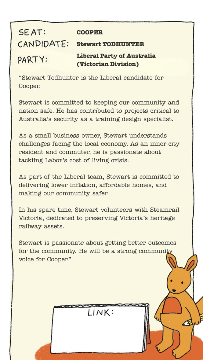
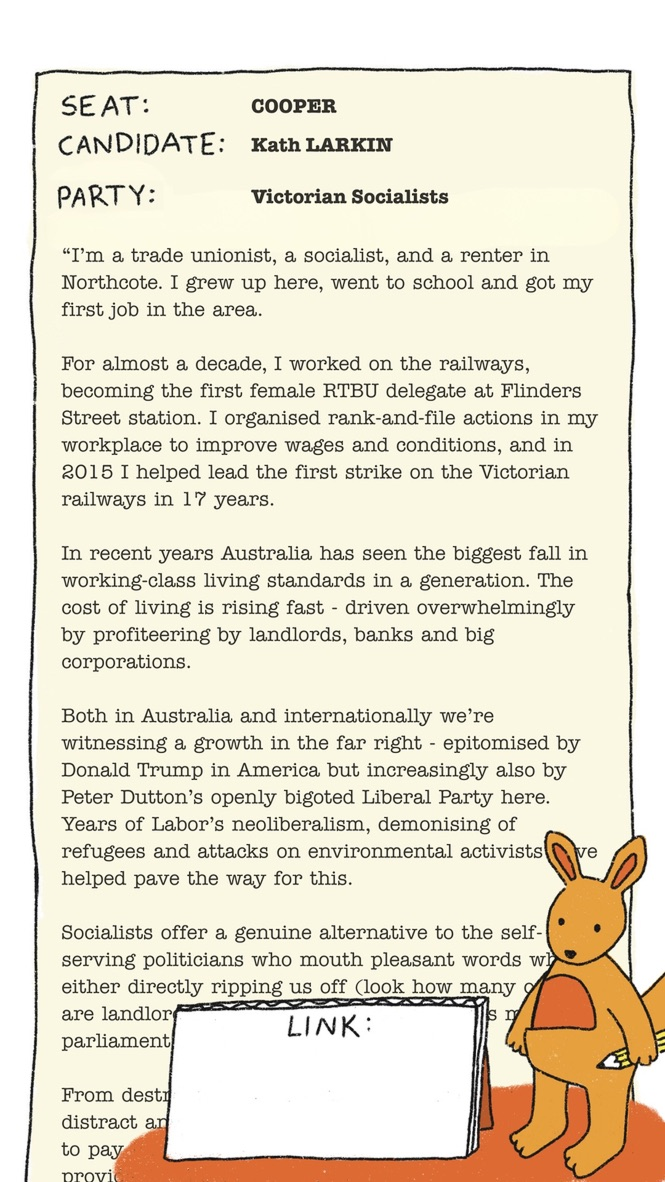
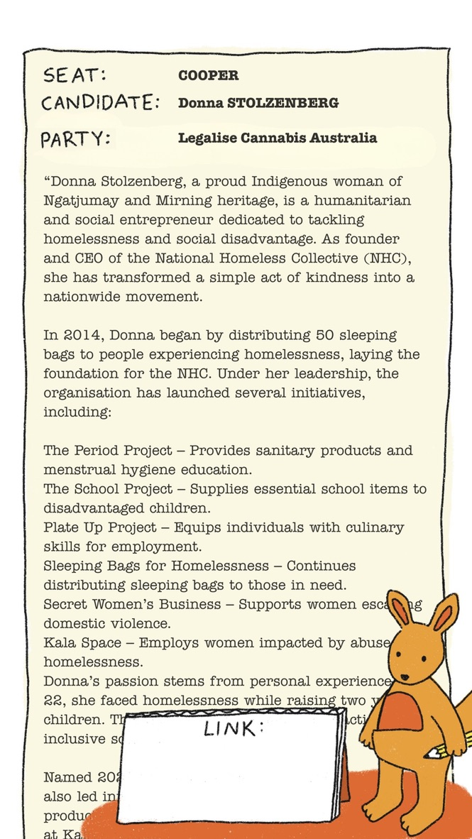
Candidate Bios
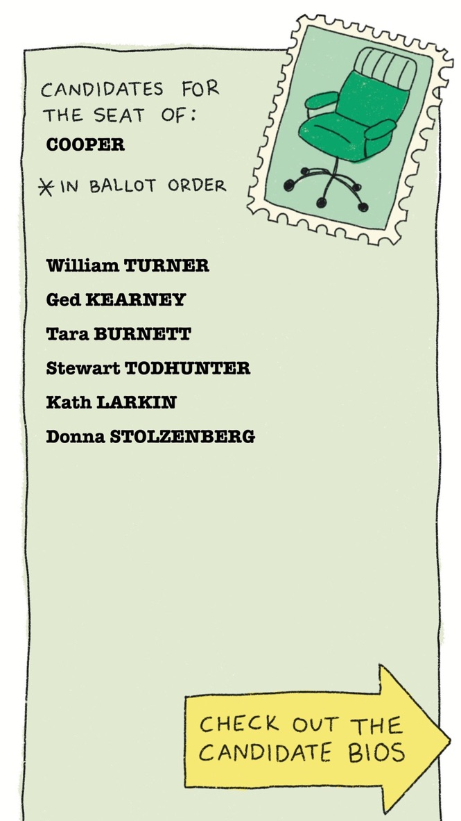
Each edition of 'Hop To It!' contains all of the registered candidates for that electorate, in the AEC's ballot order. The bios were designed to create a level playing field. By presenting candidates in ballot order and leading with their own words, we removed the visual hierarchy that usually signals who 'matters.' Voters could finally compare apples to apples.
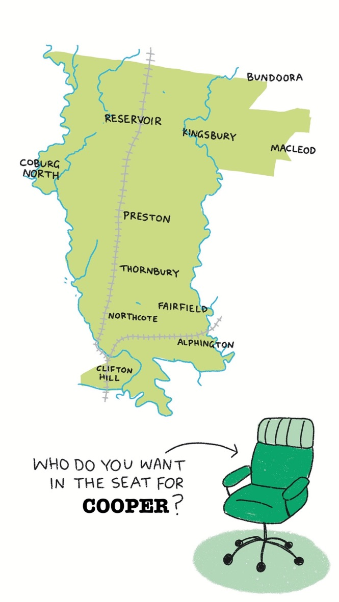
Electorate Maps
In user research (friends and family), we found that most people had only a vague sense of their electorate's geography. I made simple, hand-illustrated maps that highlight the suburbs, waterways and railways, to give voters a clearer sense of where they live. These were a hit with our audience.
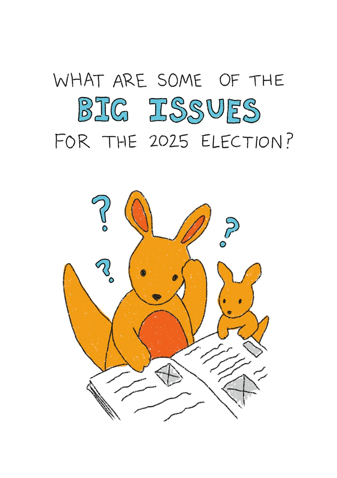
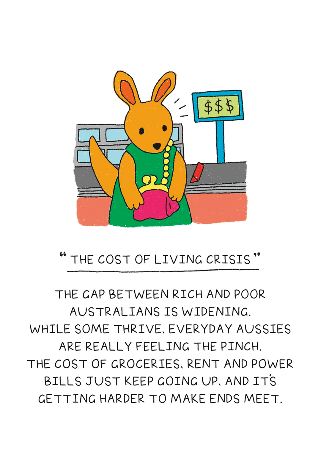
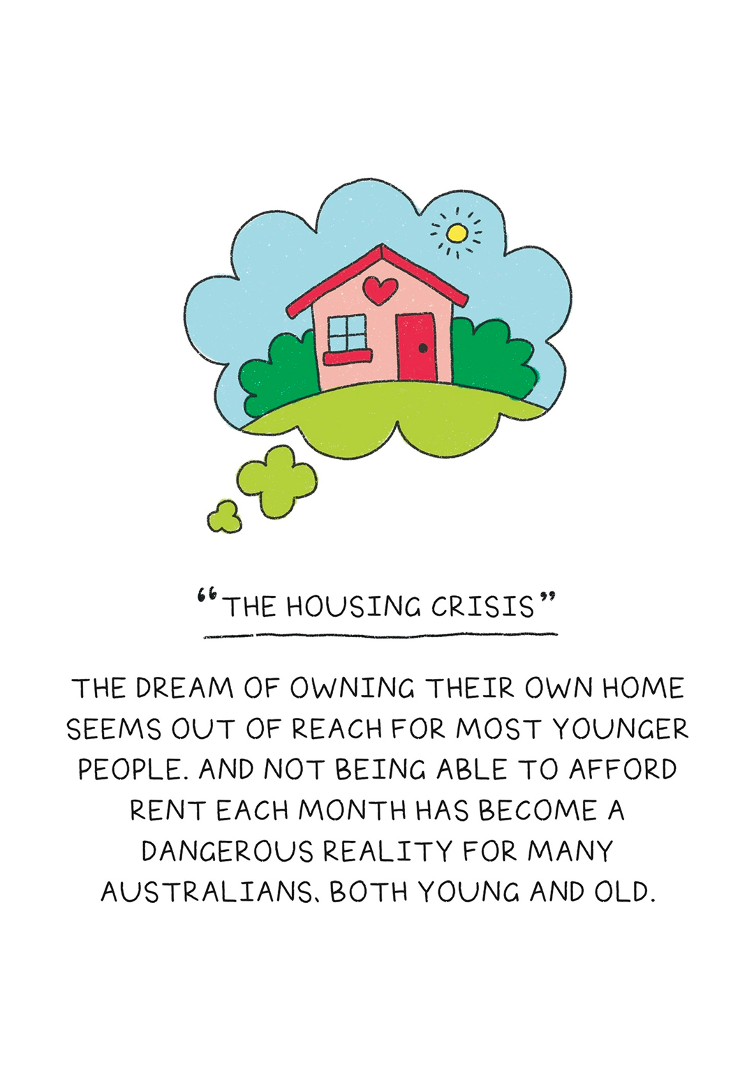
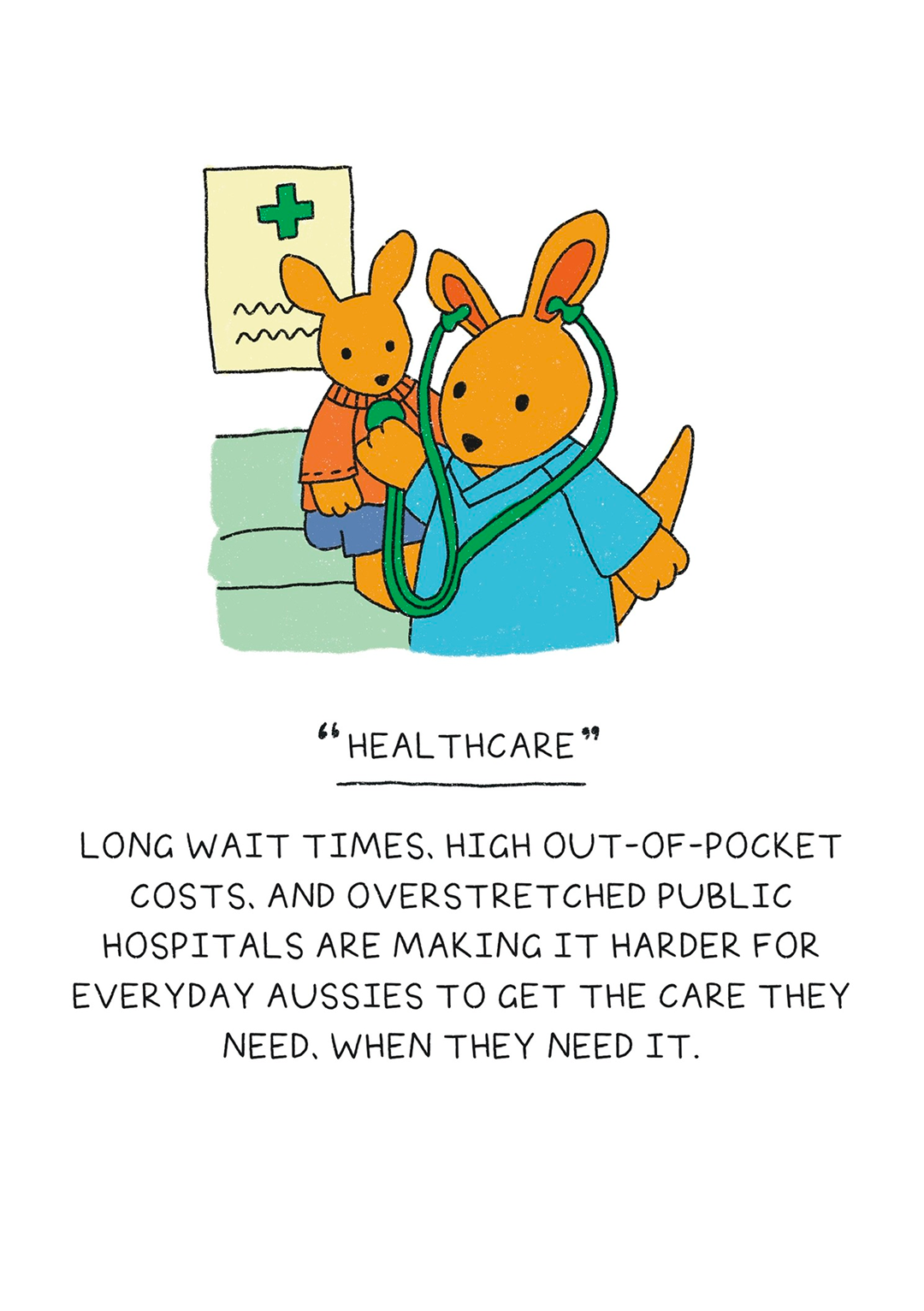
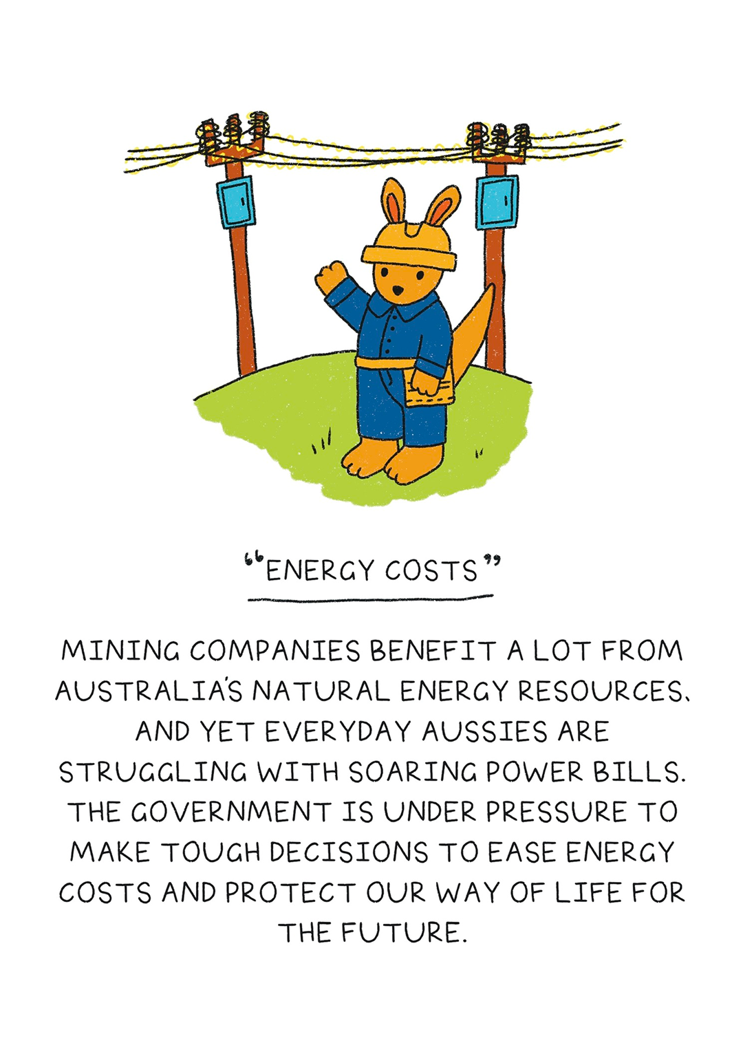
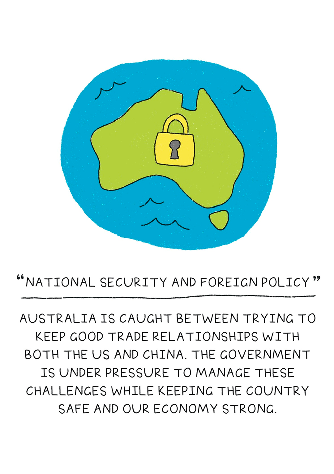
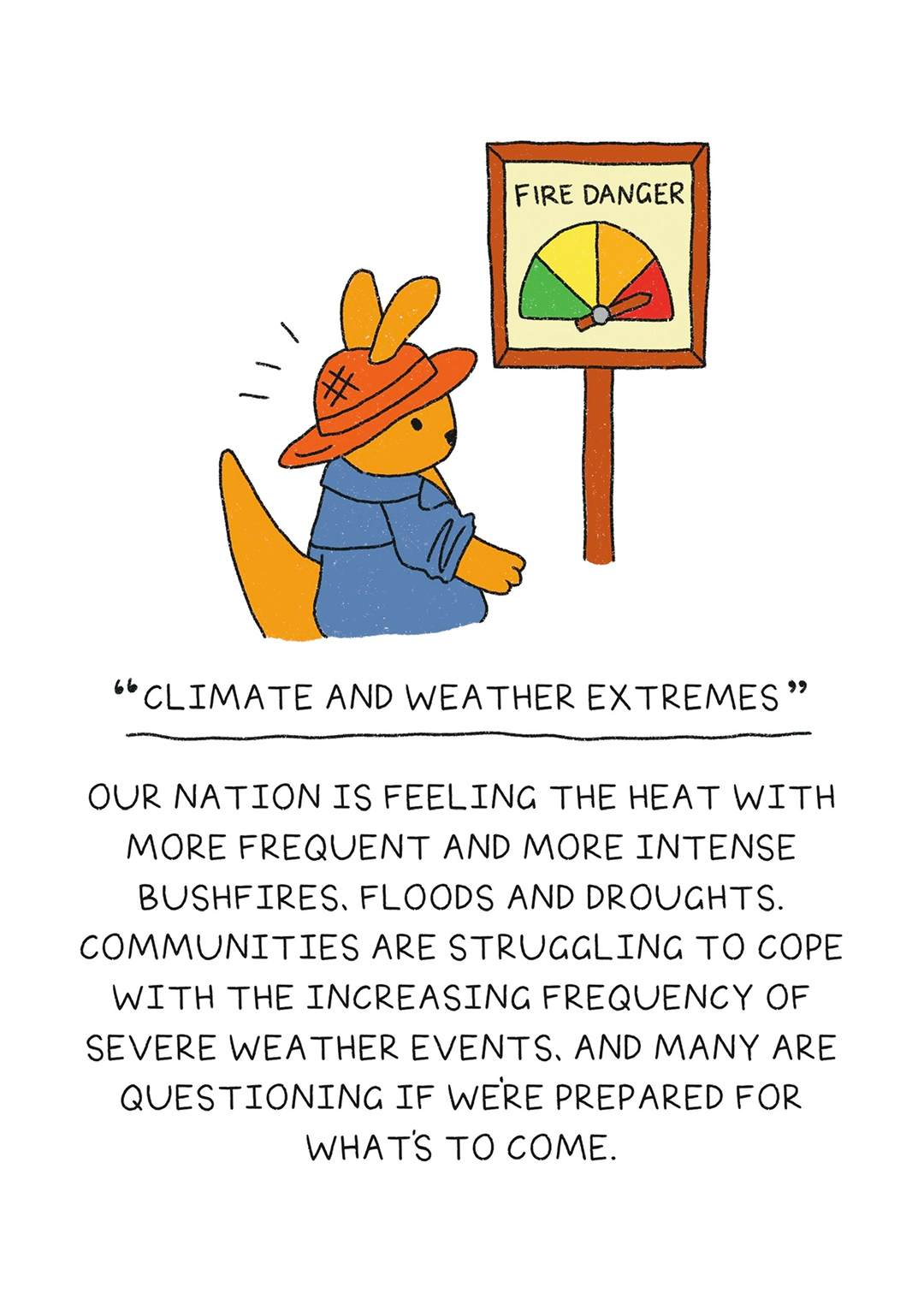
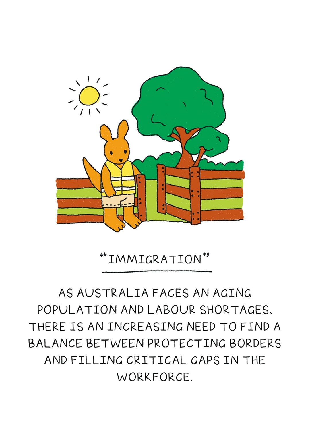
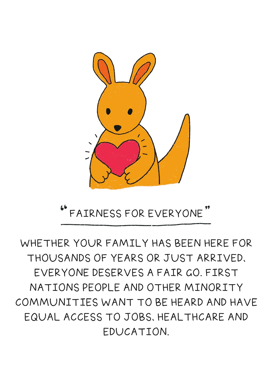
Big Issues
The Big Issues series translated the election's key policy themes into illustrated, plain-language cards. Rather than leading with data or rhetoric, we used our kangaroo characters as proxies for everyday experiences, grounding abstract policy in material reality. The aim was to cut through media noise with something that felt wholesome and accessible rather than overwhelming.
Impact
We published versions of 'Hop To It!' on Instagram for 10 different electorates and received requests to cover more; people wanted something they could send to disengaged family and friends. The format had an unexpected equity effect: by giving every candidate equal space in ballot order, independents got the same visibility as the major parties. No visual hierarchy signalling the major party contenders, just people who care about their community, laid out side by side.
An unexpected side effect: I voted independent for the first time.
We plan to adapt the project and scale it up for the next election, including printed booklets people can use as a workbook to plan their own vote.
What I Learned
Storytelling with Illustration
Working with illustration taught me that abstraction can be a form of access. By representing complex, politically charged topics through character and symbol rather than statistics or real figures, we could lower the emotional temperature and make space for curiosity instead of defensiveness.
Not everything needs to be an app.
We'd initially planned to make a web app that voters could use as a friendly hub for low-effort vote planning. But, after prototyping, we felt the project was becoming more complex than it needed to be. The book-like design allowed us to create something that wasn't a complexity wormhole. Our audience could see how many pages there were and move through them confidently.
Solving my own problem solves a problem for others
This project started as an investigation into how I could reduce the noise and cognitive load of election politics, so that I could participate authentically on election day. Turns out, a lot of people are struggling with the same thing. Teaming up with my mum gave us two perspectives to bounce off each other, and we ended up with something that landed with a lot of different people.
Check out our 'Big Issues' roundup for 2025
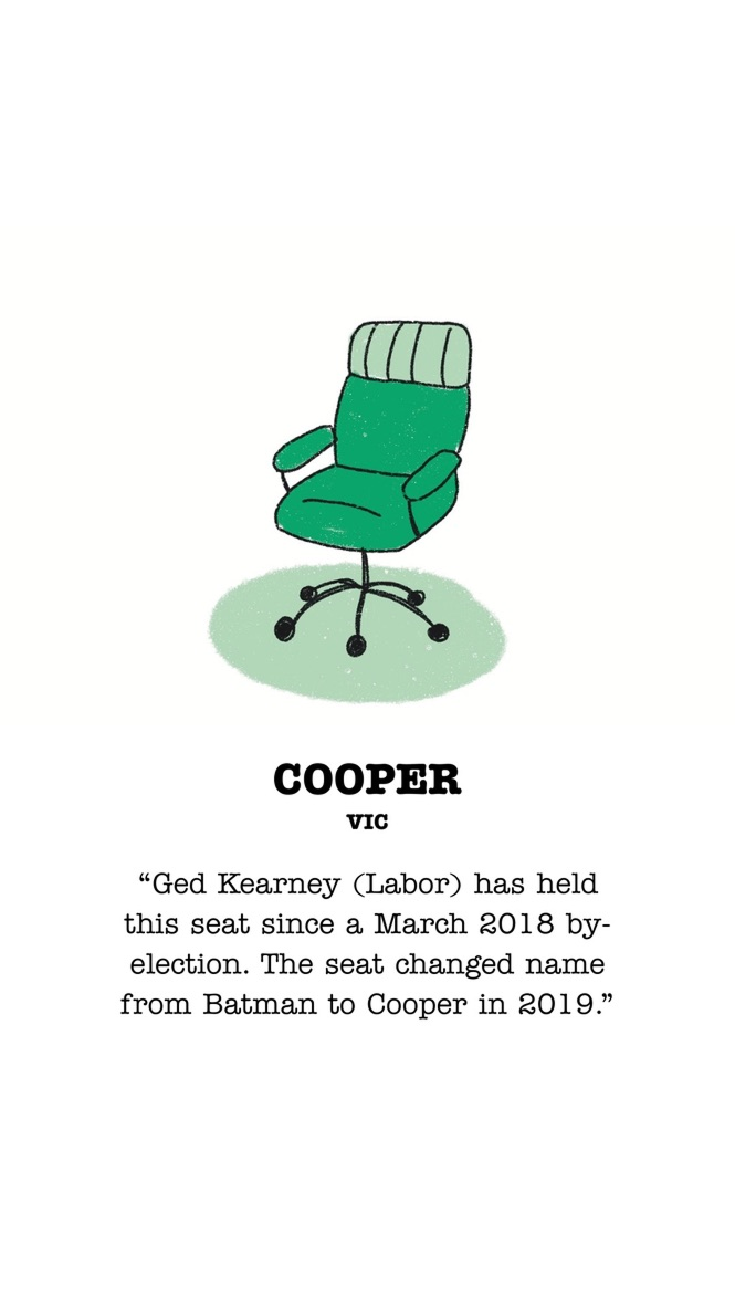
An example of page designs for the 'Cooper' electorate